Maine Listings, one of the nation’s oldest statewide MLS organizations, has announced the launch of a new brand identity and the unveiling of a new logo and visual direction that is intended to reflect its mission as a customer-centric, accessible and effective multiple listing service.
The organization, which serves 6,800 real estate professionals statewide, says the new brand marks a major milestone as it continues to evolve with advances in the industry.
“At Maine Listings, we’re not just moving with the industry. We’re committed to redefining what customer-centricity looks like, as our commitment to customer success is our north star,” said Denise Libby, CEO of Maine Listings.
“This new brand look reflects who we are today: humble and friendly, yet proud and sophisticated. It’s a visual symbol of how we blend rural beauty and hometown values with modern technology, always putting people first,” she added.
Maine Listings says the rebrand is part of a larger initiative that demonstrates its role nationally as an MLS that effectively balances high-tech tools with high-touch service. That includes the brand’s investment in in-class technologies, broker support and a passionate, client-focused team.
Maine Listings also recently gained recognition by sweeping “BEST MLS” honors in all seven categories of WAV Group’s Customer Experience Index (CXI) 2025 Survey.
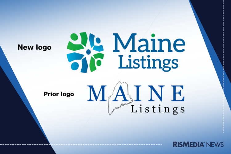
Maine Listings underscores the importance of its new logo, noting that every element is designed to reflect the brand’s values and vision. The organization says the goal is for its brand icon to stand on its own as a mark of excellence and trust.
The slightly off-center circle in the logo is meant to represent movement and progress, a nod to the organization’s evolution and commitment to helping customers advance in their careers and transactions. The circular motif is supposed to represent people, customers and homes, according to Maine Listings. It’s meant to capture a sense of community in Maine’s diverse geographies. The green and blue tones in the logo are representative of Maine’s oceans, lakes, forests and mountain ranges. Last of all, Maine Listings explains that the white space at the center of the logo forms a star, symbolizing the brand as a “North Star,” or a constant source of support, for its customers.
Libby explains that the branding process was very collaborative, involving staff, committee members and the board, and facilitated by WAV Group to ensure the final look felt authentic to all of its members.
“The change also signals a renewed internal focus on storytelling, transparency and strategic communications to connect with all stakeholders, from real estate professionals to home buyers and sellers,” she added.
“This is about more than a logo,” said Jeff Harris, 2025 president of the Maine Association of Realtors, which powers Maine Listings. “It’s about aligning our culture, communications, and customer experience. We’re proud of what this new look represents: a promise to always be evolving, listening and delivering.”
For more information, click here.


